| |

06-19-2013, 01:20 PM
|
Join Date: May 2011
Posts: 6,087
Mentioned: 3617 Post(s)
Tagged: 76 Thread(s)
Ranked Audio Record
4 Won / 0 Lost
Ranked Text Record
30 Won / 8 Lost
Exclusive Text Record
1 Won / 1 Lost
|
 "Liftoff"
Last edited by NOBLE; 06-19-2013 at 01:40 PM.
|
|
06-19-2013, 01:20 PM
|
#1
|
|
Ranked Audio Record
4 Won / 0 Lost
Ranked Text Record
30 Won / 8 Lost
Exclusive Text Record
1 Won / 1 Lost
Join Date: May 2011
Voted:
407
audio / 1061
text
Posts: 6,087
Mentioned: 3617 Post(s)
Tagged: 76 Thread(s)
|
"Liftoff"
Last edited by NOBLE; 06-19-2013 at 01:40 PM.
|
|
Offline
|

|
06-19-2013, 03:32 PM
|
Posts: n/a
Mentioned: Post(s)
Tagged: Thread(s)
|
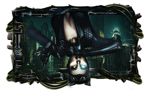
The main downside to me is that the perspective is off. The background is a normal city view, but it would have to be a down looking view for it to work with the render.
I liked the colours and most of how it's put together. The bottom dark red stuff doesn't look good when it's big, but the imperfections are smoothed out when it's smaller. The text is okay, but could use some more focus.
A nice sig all in all man. I see some big improvements in these last few.
PS. Konami has nothing to do with Superman does it? 
|
|
06-19-2013, 03:32 PM
|
#2
|
|
Guest
Voted:
0 audio / 0 text
Posts: n/a
Mentioned: Post(s)
Tagged: Thread(s)
|
The main downside to me is that the perspective is off. The background is a normal city view, but it would have to be a down looking view for it to work with the render.
I liked the colours and most of how it's put together. The bottom dark red stuff doesn't look good when it's big, but the imperfections are smoothed out when it's smaller. The text is okay, but could use some more focus.
A nice sig all in all man. I see some big improvements in these last few.
PS. Konami has nothing to do with Superman does it?
|
|
|
|
06-19-2013, 04:18 PM
|
Join Date: Oct 2008
Posts: 6,512
Mentioned: 1208 Post(s)
Tagged: 36 Thread(s)
Ranked Text Record
120 Won / 41 Lost
|
Pros-colors are good,blending isnt bad .. not a bad concept,text looks better than most that'd i've seen try in the earlier stages of GFX
Cons-the bg is kinda weird hence the "effects",light the left bright red/blackish smudge and the c4d on the right.. try and have a flow.. so if superman is riding upwards have the effects parallel to him like most of the middle BG@ the top is doing,i agree with Eth and his comment on the perspective of the city too (you could have either found a new bg or use the "transform option" and changed the perspective of the entire) thing
for the most i try and have my Render 2/3 of the canvas and the text take up 1/9 of it overall as a portion,try and work on "depth".. use burn/dodge tools and maybe HOLD "Ctr,Shift,E" then use the filter "highpass" on it "with an "soft light" layer setting near the end of ur results for a more deoth piece.. there are also some other steps but burnning and high-pass is the most i can have you do in the least amount of words lol
nice to see you getting into the grove again bro.. should join us on "sig-lab.com" some time if you feel the need to elevate proper
__________________
 "Draw to your hearts desire
and keep it
CLASSICK YA ASIAN BASTIDDD"
(DJ Denton)
Quote:
Originally Posted by Dave

|
Quote:
Originally Posted by Punk The God
ahh.. yea your a good fucker.. |
My Gallery
HERE
|
|
06-19-2013, 04:18 PM
|
#3
|
|
Ranked Text Record
120 Won / 41 Lost
Join Date: Oct 2008
Voted:
24
audio / 630
text
Posts: 6,512
Mentioned: 1208 Post(s)
Tagged: 36 Thread(s)
|
Pros-colors are good,blending isnt bad .. not a bad concept,text looks better than most that'd i've seen try in the earlier stages of GFX
Cons-the bg is kinda weird hence the "effects",light the left bright red/blackish smudge and the c4d on the right.. try and have a flow.. so if superman is riding upwards have the effects parallel to him like most of the middle BG@ the top is doing,i agree with Eth and his comment on the perspective of the city too (you could have either found a new bg or use the "transform option" and changed the perspective of the entire) thing
for the most i try and have my Render 2/3 of the canvas and the text take up 1/9 of it overall as a portion,try and work on "depth".. use burn/dodge tools and maybe HOLD "Ctr,Shift,E" then use the filter "highpass" on it "with an "soft light" layer setting near the end of ur results for a more deoth piece.. there are also some other steps but burnning and high-pass is the most i can have you do in the least amount of words lol
nice to see you getting into the grove again bro.. should join us on "sig-lab.com" some time if you feel the need to elevate proper
__________________
"Draw to your hearts desire
and keep it
CLASSICK YA ASIAN BASTIDDD"
(DJ Denton)
Quote:
Originally Posted by Dave
|
Quote:
Originally Posted by Punk The God
ahh.. yea your a good fucker.. |
My Gallery
HERE
|
|
Offline
|
|
06-19-2013, 07:01 PM
|
Join Date: May 2011
Posts: 6,087
Mentioned: 3617 Post(s)
Tagged: 76 Thread(s)
Ranked Audio Record
4 Won / 0 Lost
Ranked Text Record
30 Won / 8 Lost
Exclusive Text Record
1 Won / 1 Lost
|
I disagree with the perspective being off. The idea is that that he's swooping just above street level and then turning up away from an exploding ground underneath him. If he was high up above the city, he wouldn't still have rocks bouncing off him. He has that because he is close to the ground....where the explosion is...an he's swooping up.
I'm not a fan of of dodge/burn tools on these types of renders, although I admit I could have done a better job with the shadows and lighting. I had several adjustment layers, including everything you suggested...high-pass, soft light, etc. Thanks for the input though guys.
|
|
06-19-2013, 07:01 PM
|
#4
|
|
Ranked Audio Record
4 Won / 0 Lost
Ranked Text Record
30 Won / 8 Lost
Exclusive Text Record
1 Won / 1 Lost
Join Date: May 2011
Voted:
407
audio / 1061
text
Posts: 6,087
Mentioned: 3617 Post(s)
Tagged: 76 Thread(s)
|
I disagree with the perspective being off. The idea is that that he's swooping just above street level and then turning up away from an exploding ground underneath him. If he was high up above the city, he wouldn't still have rocks bouncing off him. He has that because he is close to the ground....where the explosion is...an he's swooping up.
I'm not a fan of of dodge/burn tools on these types of renders, although I admit I could have done a better job with the shadows and lighting. I had several adjustment layers, including everything you suggested...high-pass, soft light, etc. Thanks for the input though guys.
|
|
Offline
|
|
06-19-2013, 08:23 PM
|
Join Date: Oct 2008
Posts: 6,512
Mentioned: 1208 Post(s)
Tagged: 36 Thread(s)
Ranked Text Record
120 Won / 41 Lost
|
what you see is what you get bro, cant expo a picture.. you have to let the picture explain itself..
if you wanted to do that tho (which is nice) you could have duped the redner 2x, place one behind and motion blur it (showing him flow down to the ground) and a 2nd dupe in front motion blurred upwards.. erase most of it but keep some of the blue over the limbs to see the action of him flying upwards towards the screen kinda like i did with my spidey one (still working on the poc concept)
agrred blur and dodge are harder on flat comic like focals,you can dry taking a soft brush and making it 200-400 pixels and use the edges of the black softbrush off canvas and darken the sides of the whole border some for depth too... even dupe the whole seen image and gaussian blur it and erasenign the blurr over the foal as well.. even lowering the blurr opacity.. there's loads of way to add depth to diff pieces
did you try orange/purple G-map on soft light?.. that adds great depth and takes 2 secs
__________________
"Draw to your hearts desire
and keep it
CLASSICK YA ASIAN BASTIDDD"
(DJ Denton)
Quote:
Originally Posted by Dave
|
Quote:
Originally Posted by Punk The God
ahh.. yea your a good fucker.. |
My Gallery
HERE
|
|
06-19-2013, 08:23 PM
|
#5
|
|
Ranked Text Record
120 Won / 41 Lost
Join Date: Oct 2008
Voted:
24
audio / 630
text
Posts: 6,512
Mentioned: 1208 Post(s)
Tagged: 36 Thread(s)
|
what you see is what you get bro, cant expo a picture.. you have to let the picture explain itself..
if you wanted to do that tho (which is nice) you could have duped the redner 2x, place one behind and motion blur it (showing him flow down to the ground) and a 2nd dupe in front motion blurred upwards.. erase most of it but keep some of the blue over the limbs to see the action of him flying upwards towards the screen kinda like i did with my spidey one (still working on the poc concept)
agrred blur and dodge are harder on flat comic like focals,you can dry taking a soft brush and making it 200-400 pixels and use the edges of the black softbrush off canvas and darken the sides of the whole border some for depth too... even dupe the whole seen image and gaussian blur it and erasenign the blurr over the foal as well.. even lowering the blurr opacity.. there's loads of way to add depth to diff pieces
did you try orange/purple G-map on soft light?.. that adds great depth and takes 2 secs
|
|
Offline
|
|
 Posting Rules
|
You may not post new threads
You may not post replies
You may not post attachments
You may not edit your posts
HTML code is Off
|
|
|
All times are GMT -4. The time now is 09:54 PM.
|
|
|

 Battle Feed


 Linear Mode
