
my bad was meaning to get to this earlier but wanted to not rush a comment
they're both dope man,
1st one kinda has a galactic (marvel) type vibe to it mixed in with some emotion, color composition is nice, SOME SCI-FI TO IT TOO,(caps lock just now ignore it), looks like u went a bit crazy with Topaz lol but it kinda goes, maybe tone it down a bit tho cause topaz is more of a crutch and messes up instead of make better most pictures depeending on what it is, luckily this is more sci-fi tho and it goes more with it, blending aint bad either
thing tho is kinda looks flat, add some depth, and do something with the text looks awkward, nice try and typography tho just placing is off and the effect of the clipping mask wasnt all that appealing, took away from the picture itself (*well done tho), also some foreground effects would be nice maybe some meteors or somthing
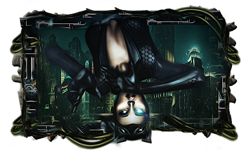
2nd one pretty abstract, nice color composition again, overall a nice piece
thing is the orb looks kinda forced, its whole body look like its moving but the orb just looks unaffected by the motion of the "w.e" it is in general lol, for the most i know what you did here, and have a few of the brushes myself lol, overall has a pretty good "flow" to it all well done
__________________
 "Draw to your hearts desire
and keep it
CLASSICK YA ASIAN BASTIDDD"
(DJ Denton)
Quote:
Originally Posted by Dave

|
Quote:
Originally Posted by Punk The God
ahh.. yea your a good fucker.. |
My Gallery
HERE
|


 Battle Feed


 Linear Mode

